Appearance
Page Builder
The Page Builder is a visual editor where you design your storefront pages. It works like a drag-and-drop canvas — you add content blocks (called sections), customize the look of your navigation bar and theme colors, and see a live preview of the result before publishing.
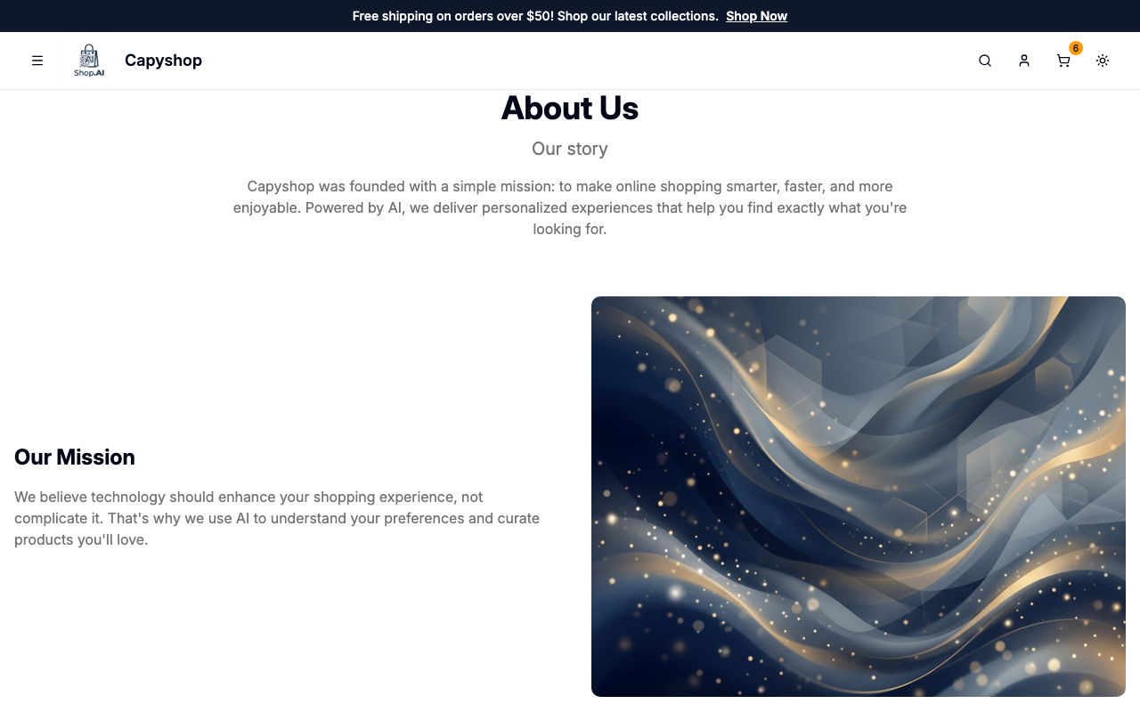
Every store starts with a Home page. You can also create custom pages (e.g., About Us, Contact, Promotions) that get their own URL on your storefront.
Managing pages
Open Pages in the admin sidebar to see all your storefront pages. The Home page is always listed first.
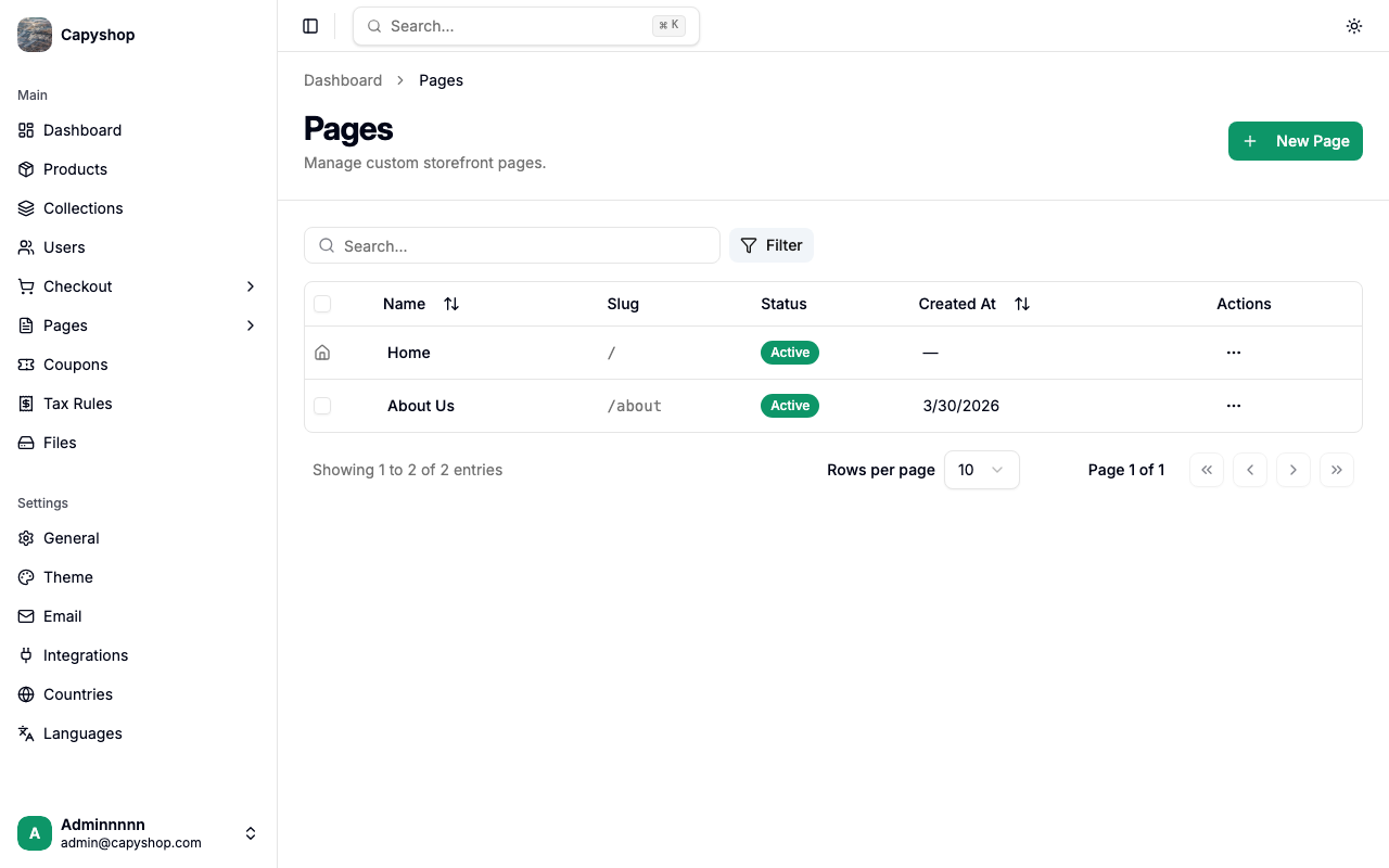
| Column | Description |
|---|---|
| Name | The page title shown in the admin |
| Slug | The URL path on your storefront (e.g., /about) |
| Status | Active (visible on the storefront) or Inactive |
| Created At | Date the page was created |
From this screen you can:
- Create a page — click New Page in the top-right corner. This opens the builder with a blank page.
- Edit a page — click a page name or choose Edit from the actions menu. This opens the builder with that page loaded.
- Activate / Deactivate — toggle visibility from the actions menu or use the bulk checkboxes.
- Delete — remove a page from the actions menu or in bulk.
Important: The Home page cannot be deleted or renamed from this screen. Its metadata is managed in store settings.
Opening the builder
When you click New Page or Edit, the Page Builder opens in a full-screen layout:

The builder has three main areas:
| Area | Description |
|---|---|
| Primary sidebar | A narrow icon bar on the far left with four panel buttons (top to bottom): Metadata, Sections, Navbar, Theme |
| Secondary sidebar | The active panel's controls — where you edit content, settings, or styles |
| Live preview | An iframe showing your page exactly as customers will see it. Updates in real time as you make changes |
The top bar contains:
| Control | Description |
|---|---|
| Back | Returns to the pages list (warns if you have unsaved changes) |
| Page selector | Dropdown to switch between pages without leaving the builder |
| Viewport switcher | Toggle between Desktop, Tablet, and Mobile preview sizes |
| Discard | Reverts all unsaved changes instantly |
| Save | Opens a confirmation dialog, then saves everything to the database |
Page metadata
Click the document icon (first icon in the primary sidebar) to open the metadata panel. For new pages, this panel opens automatically.
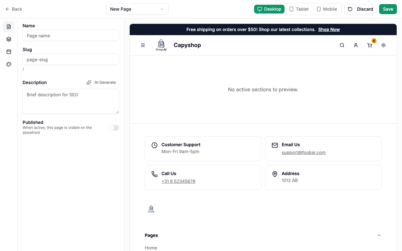
| Field | Description |
|---|---|
| Name | The page title (required). When creating a new page, changing the name automatically generates a slug |
| Slug | The URL path for the page (required). Only lowercase letters, numbers, and hyphens are allowed |
| Description | An optional description for SEO purposes. You can also use the AI Generate button if AI integrations are enabled |
| Published | Toggle to make the page visible on the storefront |
Tip: The slug preview below the field shows the full URL path (e.g.,
/about-us). Once you manually edit the slug, it stops auto-generating from the name.
For the Home page, the metadata panel shows a read-only notice — the home page name and description are managed from the store's general settings.
Working with sections
Click the layers icon (second icon in the primary sidebar) to open the sections panel. This is where you add and organize content blocks.
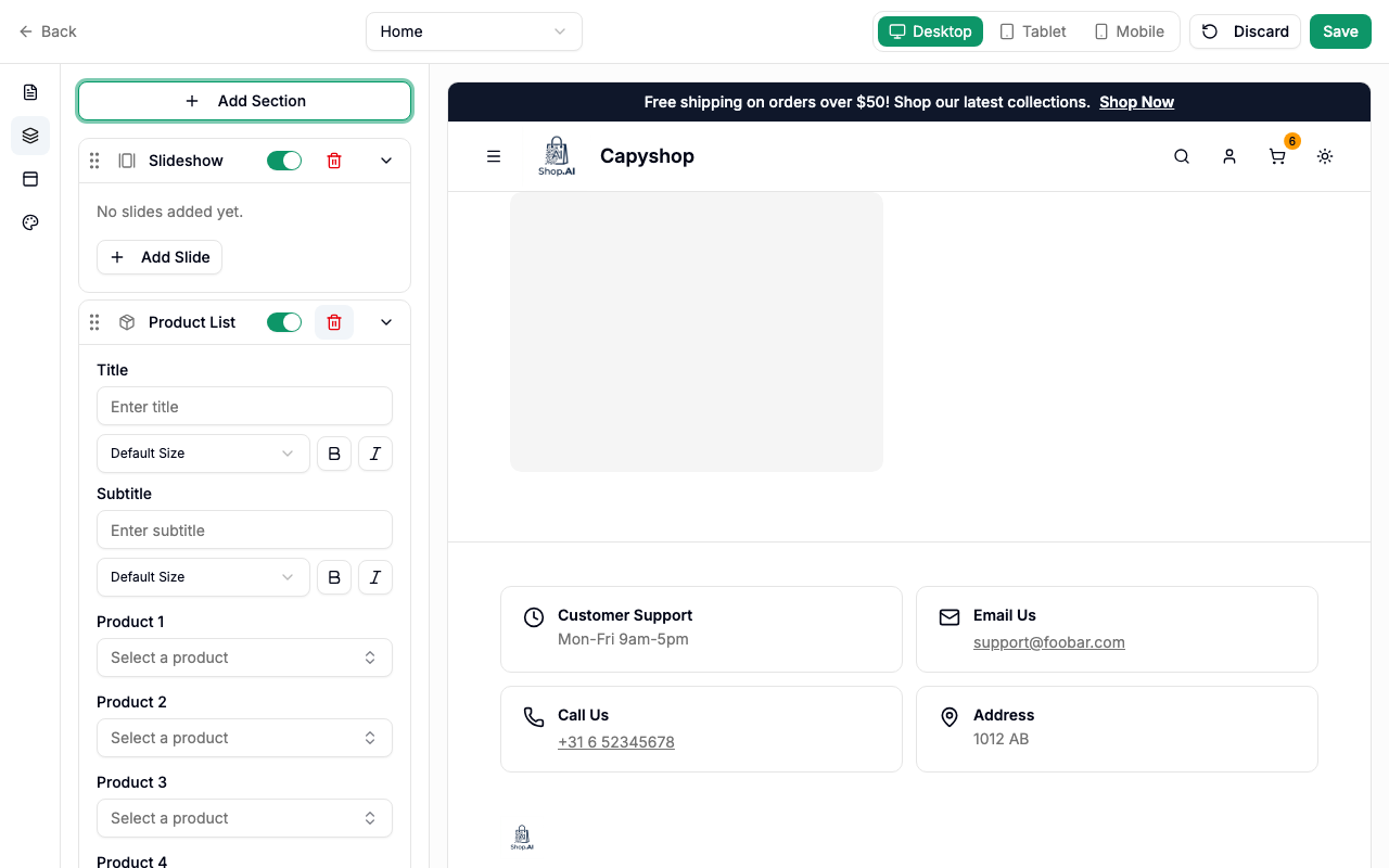
Each section in the list shows its type icon and label. You can:
- Add a section — click Add Section and choose from the dropdown menu
- Reorder — drag sections up or down using the grip handle on the left
- Expand / Collapse — click a section's name to reveal its settings
- Toggle visibility — use the switch to show or hide a section without deleting it
- Remove — click the trash icon (requires confirmation)
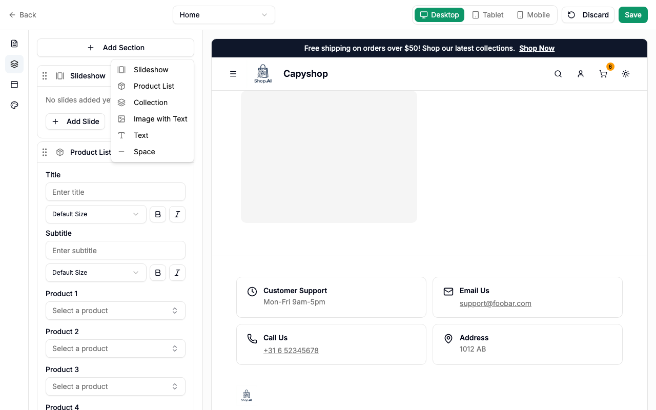
Seven section types are available:
| Type | Best for |
|---|---|
| Slideshow | Hero banners, promotions, featured content |
| Product List | Showcasing specific products |
| Collection | Highlighting a product collection |
| Image with Text | Storytelling, brand messaging, feature highlights |
| Text | Announcements, descriptions, policies |
| Coupon List | Spotlighting active discount codes for shoppers |
| Space | Visual breathing room between sections |
Customizing the navbar
Click the panel-top icon (third icon in the primary sidebar) to open the navbar customization panel.
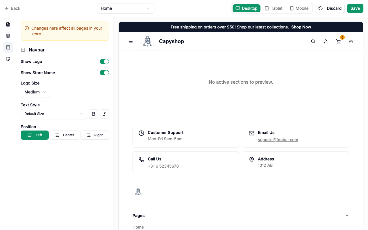
Important: Navbar changes apply globally to all pages, not just the page you're currently editing.
| Setting | Description |
|---|---|
| Show Logo | Toggle the store logo in the navigation bar |
| Show Store Name | Toggle the store name text next to the logo |
| Logo Size | Choose from sm, md, lg, xl, or 2xl |
| Text Style | Set the store name font size, bold, and italic |
| Position | Align the logo and store name to the left, center, or right |
Customizing the theme
Click the palette icon (fourth icon in the primary sidebar) to open the theme customization panel.
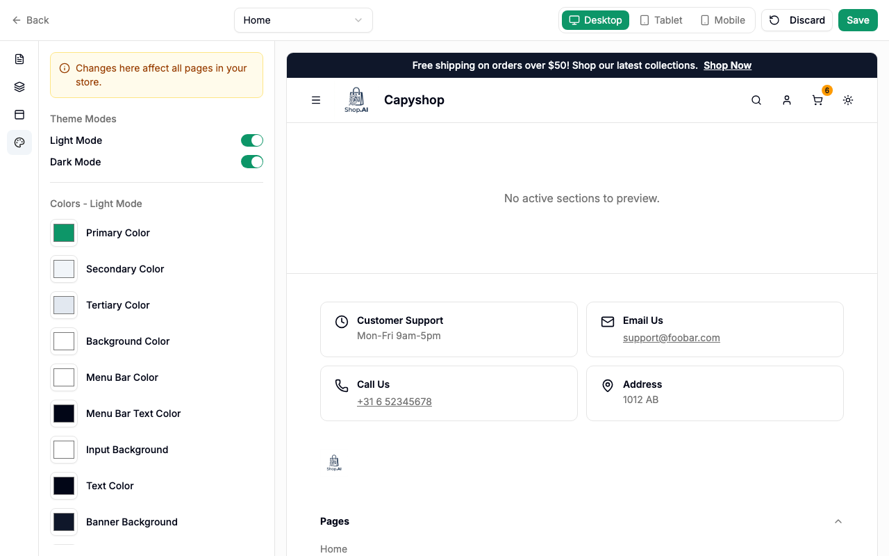
Important: Theme changes apply globally to all pages, not just the page you're currently editing.
Mode toggles:
| Setting | Description |
|---|---|
| Light Mode | Enable or disable the light color scheme |
| Dark Mode | Enable or disable the dark color scheme |
At least one mode must remain enabled at all times.
Color fields (10 per mode):
| Color | What it controls |
|---|---|
| Primary Color | Buttons, links, and accent elements |
| Secondary Color | Secondary UI elements |
| Tertiary Color | Additional accent color |
| Background Color | Page background |
| Menu Bar Color | Navigation bar background |
| Menu Bar Text Color | Navigation bar text |
| Input Background | Form input fields |
| Text Color | Main body text |
| Banner Background | Promotional banner bar background |
| Banner Text Color | Promotional banner bar text |
Font:
| Setting | Description |
|---|---|
| Font Family | Choose a global font from the available system and Google Fonts |
Saving and publishing
When you're happy with your changes, click Save in the top-right corner. A confirmation dialog appears:
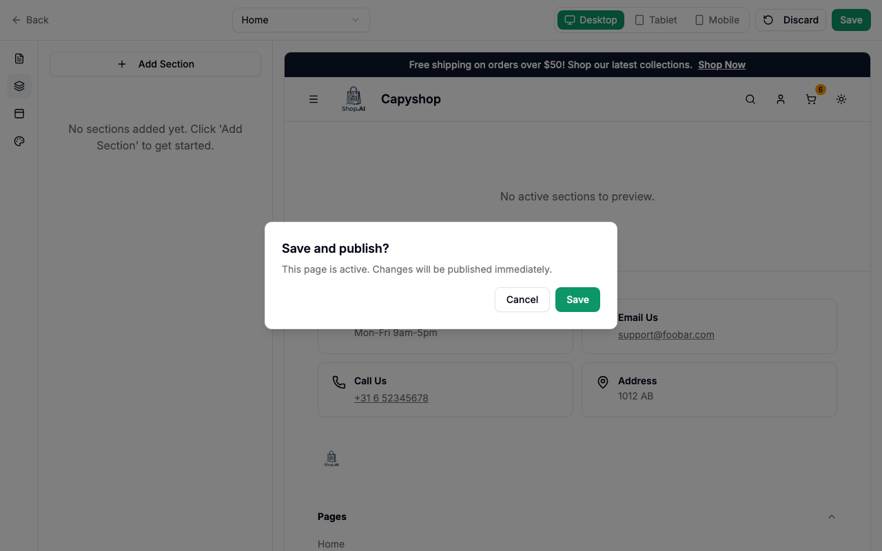
- If the page is published (active), the dialog confirms you're publishing changes live.
- If the page is a draft (inactive), the dialog confirms you're saving without making the page public.
The save process uploads any staged images, creates the page (if new), and saves sections, navbar settings, theme settings, and page metadata all at once.
Click Discard at any time to revert all unsaved changes to the last-saved state.
How pages appear on the storefront
Home page
The home page is the first thing visitors see. It renders all active sections in the order you defined in the builder.
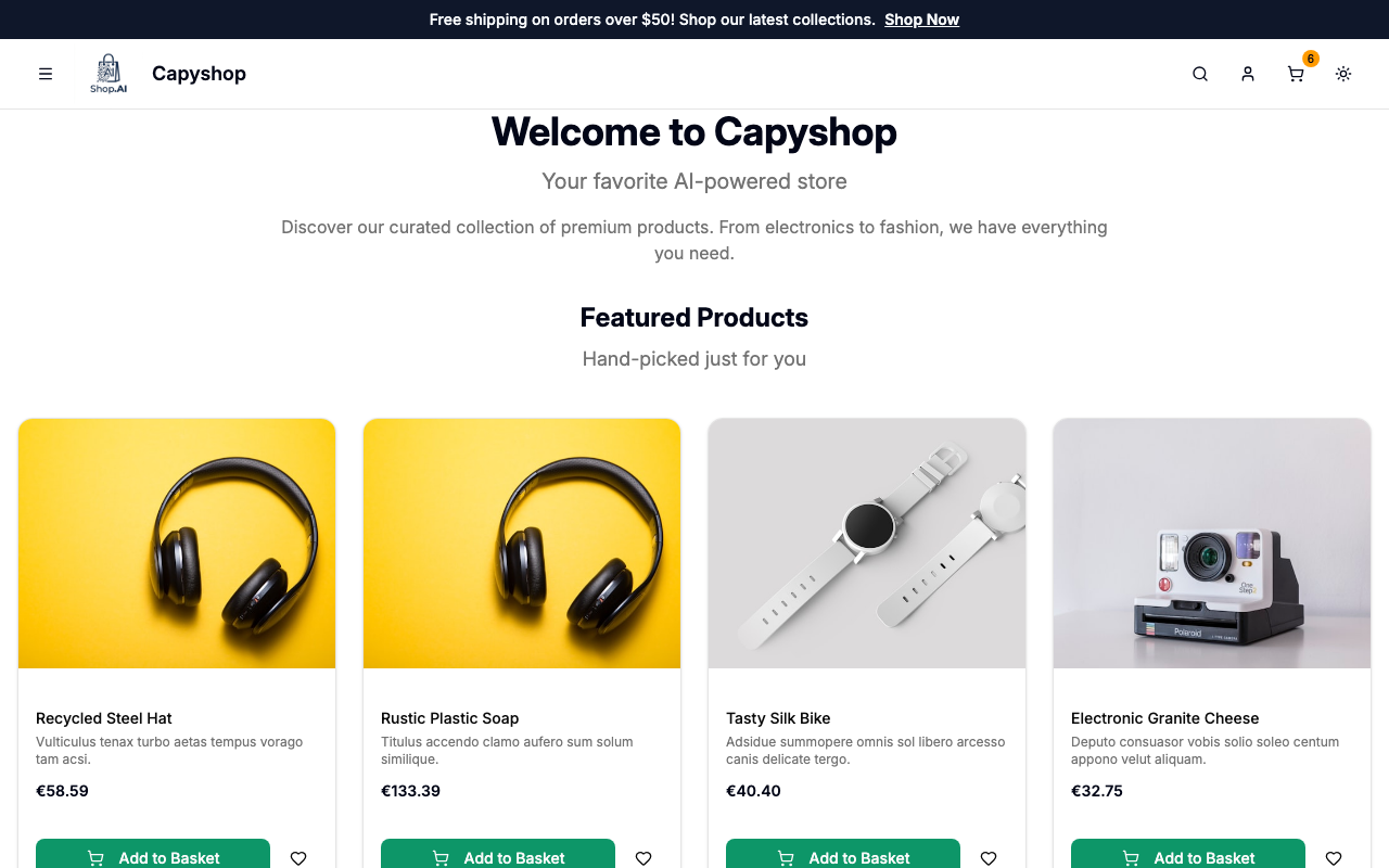
Custom pages
Custom pages are accessible at their slug URL (e.g., yourstore.com/about). They render the same way as the home page — each active section appears in order.
Only active pages with the Published toggle enabled are visible on the storefront. Inactive pages return a 404 error.
Custom pages also appear in the storefront's mobile navigation menu and footer, making them easy for customers to find.